Framework is fully responsive and works on phones and tablets. The mobile layout replaces the desktop sidebar with a bottom navigation bar and uses full-screen panels for each activity.
Bottom Navigation Bar
On mobile, the activity bar and sidebar are replaced by a bottom navigation bar with five buttons:
| Button | Action |
|---|---|
| Home | Project dashboard |
| Chat | Conversation list and AI chat |
| + (Plus) | Start a new conversation |
| Documents | Document tree and uploads |
| Menu (Grid) | Access additional features |
Menu Dropdown
Tapping the Menu (grid) button opens a dropdown with additional options:
- Switch Project — Shows current project name; tap to go to the projects list.
- Account Settings — Profile, security, billing.
- Project Settings — Project configuration.
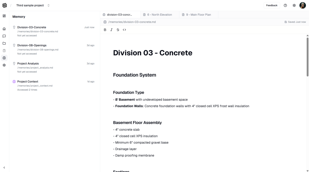
- Memories — AI memory files.
- Notes — Project notes.
- Get Help — Submit a support request.
- Send Feedback — Report bugs or suggest features.
Content Sheets
On mobile, content that would open in sidebar panels or tabs on desktop instead opens as full-screen sheets that slide up from the bottom. This includes:
- Document viewer (PDF viewer)
- Note editor
- Memory file viewer
- Settings panels
Swipe down or tap the close button to dismiss a sheet and return to your previous view.
Mobile Chat
The chat experience on mobile is optimized for smaller screens:
- The conversation list takes up the full screen.
- Tapping a conversation opens the chat in a full-screen view.
- The message input stays fixed at the bottom of the screen.
- Citations in AI responses open documents in a full-screen sheet overlay.
Tips for Mobile Use
- Use the + button in the center of the bottom nav to quickly start a new chat.
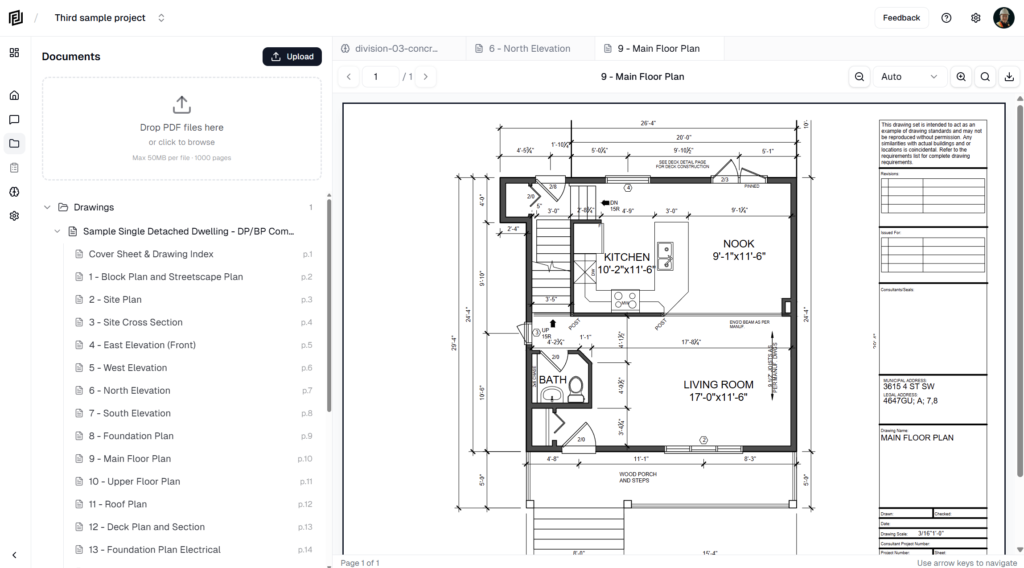
- Documents open in the built-in PDF viewer — pinch to zoom on drawings and details.
- The mobile interface supports haptic feedback on supported devices.