A lot of work has gone into cleaning up the platform and creating a more cohesive experience for our users over the last two weeks.
Added
- Public Share Pages — Publish any note, sheet, estimate, or schedule to a public read-only link that anyone can open without logging in. Shared pages render with the same editors you use in the app, and you can brand them with a company from your directory — logo, name, and accent color across the top. Toggle sharing on or off from the document’s actions menu; your link stays the same when you re-enable it.
- Custom Icons for Documents — Give any note, sheet, schedule, or collection its own icon. Pick an emoji or an icon from the library, and it shows in the sidebar, the breadcrumb, and at the top of the document — so your workspace reads at a glance.
- Richer Notes — To-do checkboxes, collapsible toggle blocks, and better links: hover a link for a preview menu, click to follow. Plus a “+” handle next to each block that opens the command menu in place.
Changed
- Schedule Editor Upgrades — A batch of editing improvements for building schedules fast: bar labels on the Gantt timeline (task name, dates, duration, % complete — configurable per schedule), copy and paste tasks with Ctrl/Cmd+C and V, an Excel-style fill-down handle on name and duration cells (names auto-increment: “Pour slab 1” → 2, 3…), and the Insert key to add a task below the current row. Bulk-linking tasks is now a single fast operation, new tasks default to 5 working days, and connector dots stay separated on narrow bars.
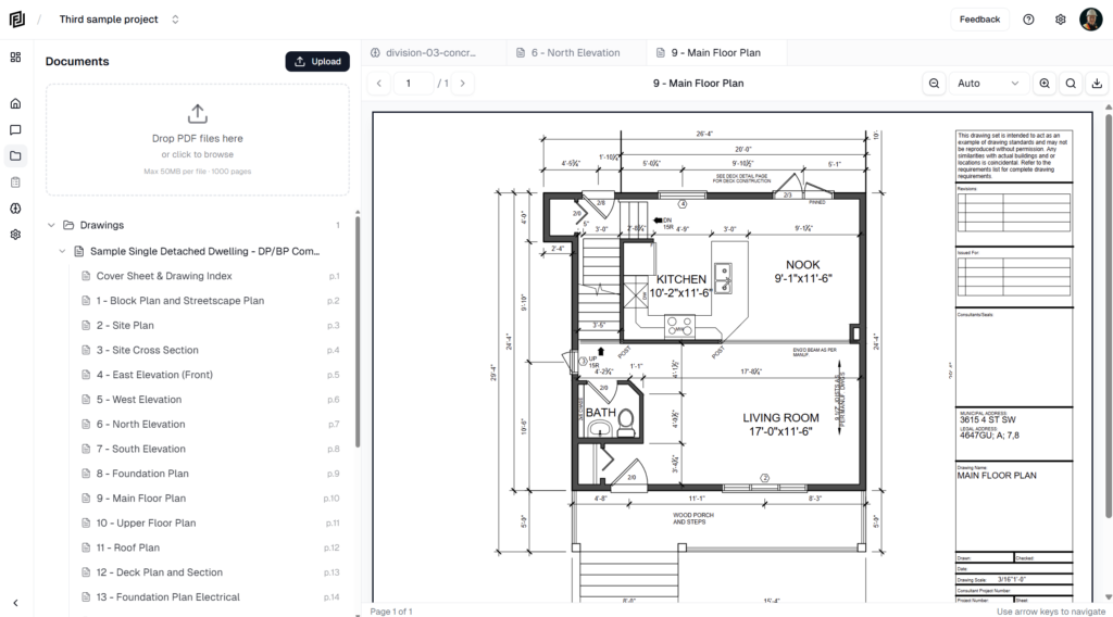
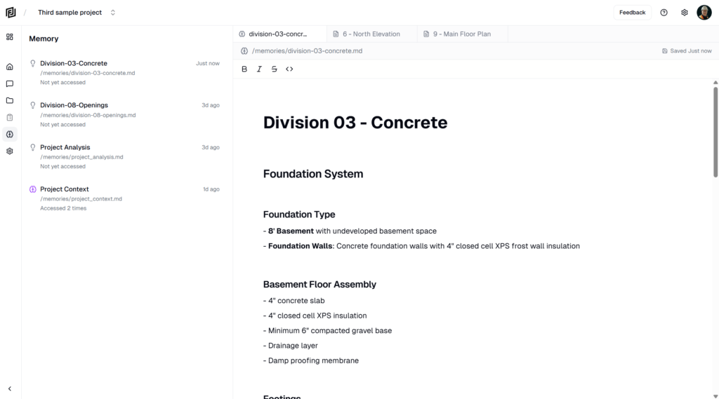
- Redesigned Workspace Chrome — The project workspace got a cleaner frame: the top bar is gone, replaced by a breadcrumb header with the project switcher, your open file, and its save status, export, and actions all in one place. The icon rail now runs full height, Home and Workspace merged into a single landing tab, and chat controls float over the conversation instead of sitting in a solid header.
- Refreshed Look — A full palette refresh across the app: warm stone neutrals, a refined indigo-blue accent, and clearer hover and selected states. Settings screens were standardized across account, workspace, and project with larger headers and consistent layouts, and mobile settings moved into a slide-in panel that matches desktop.
- Mobile Parity — The mobile document header now has the same actions as desktop: export, share to web, copy, and delete for notes, sheets, estimates, and schedules.
- Mobile Editing Toolbar — Editing notes on your phone now uses a single docked formatting bar with the full desktop formatting set plus move-up/move-down buttons — no more fiddly drag handles on touch screens. It stays reachable above the keyboard on iOS and Android.
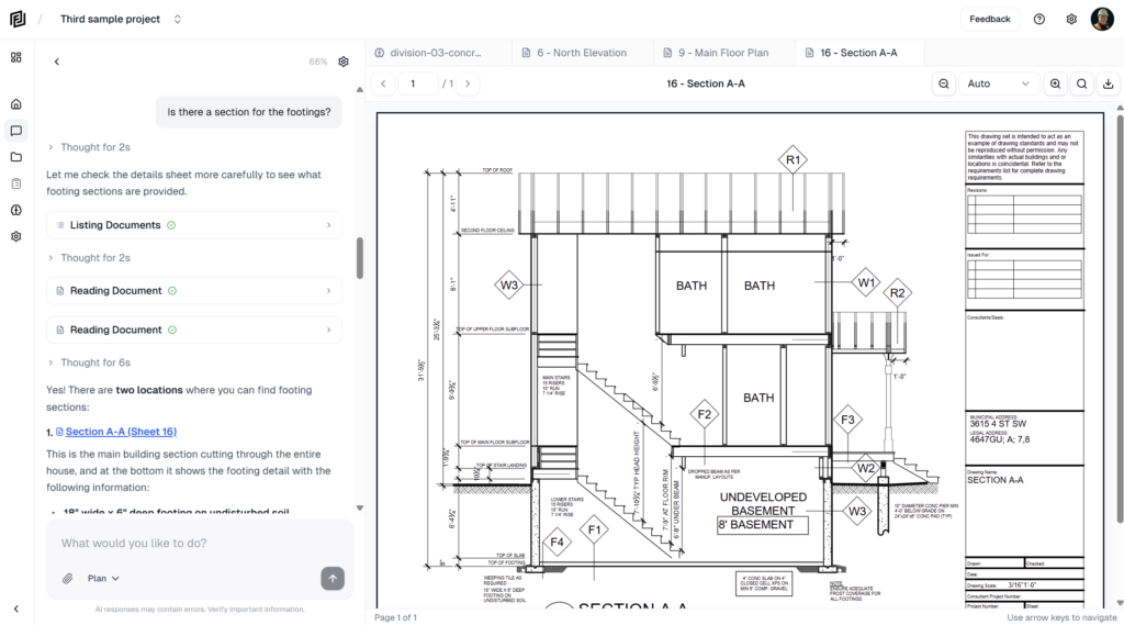
- More Natural AI — The assistant uses your name the way a colleague would — a greeting up front, sparingly after that.
- Mobile Create Button — A new “+” button in the mobile tab bar starts a new agent chat or a new page in one tap.
- Message Feedback — Thumbs up or down on any AI response (with an optional comment) so you can tell us directly when the assistant nails it or misses. Copy and retry buttons got satisfying feedback too.
- Sample Project for New Users — New accounts now start with a sample project — real drawings, a welcome note, and a ready-to-send first question — so you can see what Framework does before uploading your own documents.
Fixed
- PDF Zoom — Pinch and trackpad zoom in the document viewer no longer snaps the view to the left edge of the drawing. Zooming now holds your position correctly.
- Long Conversations — Fixed an error that could break a conversation after it was compacted, leaving the AI unable to respond until you started a new chat.
- Documents Reopening Themselves — Returning to a past conversation no longer reopens documents the AI had created in it.
- RFI Detail View — Restored the Question and Attachments fields on RFI entries, brought back the grouped layout (Details, People, Dates, Impact & References), and removed the duplicated subject field.